Nightingale’s polar area diagrams paved path to improve hospital conditions
Emphasis on numerical context (total numbers) to avoid misleading statistics
Nightingale’s data visualisation now standard tools in modern technology
Embargo: Tuesday 16 May 1pm (UK time)
We would like to invite you to a lecture on The Mathematical Life of Florence Nightingale, by Professor Sarah Hart on Tuesday 16 May 1pm (UK time) at David Game College or online. Professor Hart will explore how Florence Nightingale used statistical diagrams to campaign for sanitation reform in hospitals and encourage professional training for nurses.
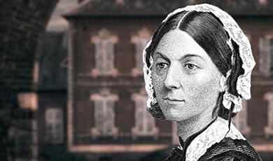
During the Crimean War, Florence Nightingale took “a group of nurses to work in the military hospitals, the first time women had been permitted to serve in an official capacity. These hospitals were filthy. There was no real sanitation, no ventilation, no proper facilities for washing, not even the most basic plumbing… Nightingale set to work immediately to improve things, and the reforms she pushed for certainly saved thousands of lives. She returned from Crimea a celebrity and spent the rest of her life campaigning, with huge success, for improvements in the way hospitals were run, both military and later civilian hospitals, for sanitation reform, and for the professionalisation of nursing, with nurses receiving proper training and qualifications.”
Hart will then say, “she campaigned to put nursing on a professional footing, and for nurses to be trained. But there were objections when it was found that there was a higher chance of dying under the care of a trained nurse than an untrained one! How can this be? The issue is the underlying population. If you have a hospital with trained nurses and untrained ones, how are you going to allocate patients? What was happening was that the trained nurses were being assigned to the sickest patients, who quite naturally have the highest chance of dying, whoever they’re being looked after by. This is a huge pitfall: not comparing like with like. In medicine, the average survival rates for different groups undergoing medical procedures are nowadays properly taken into account when assessing performance of surgeons.”
Though Nightingale did not invent polar area graphs, Hart will point out that her most famous chart is a polar area chart representing mortality in the army. “What the polar area diagram does is to show in a very clear way this information as it changes over the year, with the advantage that we are quite used to associating time with circles: clocks, which after all are just circles divided into twelve, are all around us. So, putting the months of a year around a circle with their data feels very natural. For each month, there are regions representing the deaths from wounds, the deaths from “zymotic” or preventable diseases, and the deaths from other diseases.”
Hart will give the example of “January 1855, where out of an army of 32,393 men, 2761 died of preventable diseases, this is men in every 1000, which over the year would mean 1022.8 of every 1000 men would die of preventable diseases. This sounds like it must be wrong, but it is possible when we remember that when people die they are replaced. So you could have an army of 40,000 and still have 50,000 deaths over a year.”
“The graph and others did not cause the clean-up in Crimea; it was produced later. What it did was to give such compelling evidence of their efficacy that it led to permanent reform of the way hospitals are run. When you have your annualized death rates for each month, you can then plot them around a circle, using a suitable scale. In our case, with the 120, 240, 60, we want wedges whose areas are in those proportions... If our radius representing a death rate of 60 is say 1cm, then doubling the radius gives an area of four times the original wedge, so a wedge with radius 2cm corresponds to the 240 death rate... Looking again at the polar area diagram produced by Florence Nightingale, we can now see that it shows a huge proportion of deaths were preventable, and that those rates were dramatically improved when the sanitation reforms came in. It doesn’t tell us for sure that absolute numbers of deaths came down, though they did, because we don’t know the size of the army from this diagram, but that’s not what matters.”
Hart will conclude by saying, “This is why we rightly remember Florence Nightingale as a pioneer of data visualisation. Diagrams like the ones she used are now standard tools. And of course we can now exploit new technology, like 3-d graphs, and even animations where one can watch the data evolving, for example in the amazing work of people like Hans Rosling. Nightingale believed that statistics was “the most important science in the world”: “to understand God’s thoughts, we must study statistics for these are the measure of His purpose”.
ENDS
Notes to Editors
You can sign up to watch the hybrid lecture online or in person; or email us for an embargoed transcript or speak to the lecturer: l.graves@gresham.ac.uk / 07799 738 439
Read more about Professor Hart.
Sign up to our monthly newsletter here to get advance notice of our events.

 Login
Login